
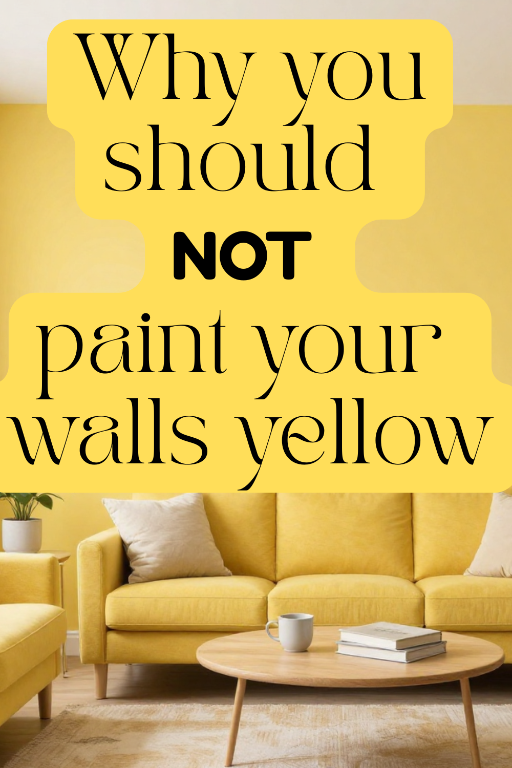
Why You Should NOT Embrace the Yellow Paint Trend – listen up!
Yellow paint is having a moment. From social media reels to design magazines, sunny yellow walls are being marketed as happy, bold, and on‑trend. But before you pick up that can of buttercup or marigold, it’s worth taking a step back.
Despite its popularity, yellow paint is one of the most problematic color trends in interior design. What looks cheerful online can quickly become overwhelming, dated, or downright unpleasant in real life. Here’s why you should seriously think twice before embracing the yellow paint trend—and what to consider instead.

Why You Should NOT Embrace the Yellow Paint Trend
Yellow Paint Is Harder to Live With Than You Think
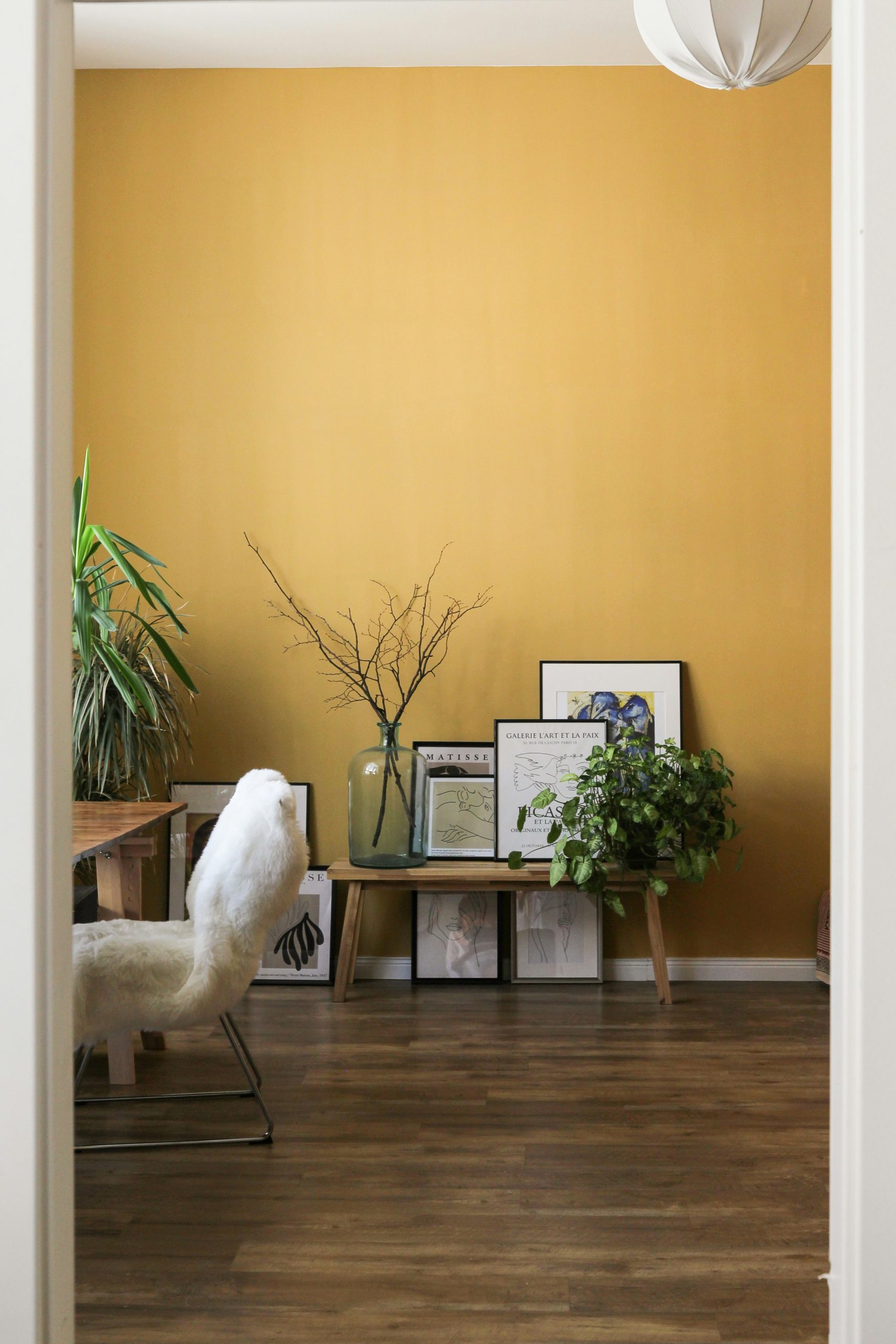
Yellow is one of the most emotionally stimulating colors on the spectrum. While small doses can feel energizing, large areas of yellow—especially on walls—can cause visual fatigue over time.
Many homeowners report that yellow rooms feel:
- Overly bright or harsh
- Stressful rather than uplifting
- Difficult to relax in, especially in bedrooms and living spaces
Design trends come and go, but wall color is something you live with every day. What feels cheerful at first can quickly turn into irritation.
Yellow Is Extremely Lighting‑Dependent
One of the biggest problems with yellow paint is how dramatically it changes under different lighting conditions. Natural light, artificial bulbs, shadows, and even the time of day can completely alter how yellow appears.
In many homes, yellow paint can suddenly look:
- Sickly or muddy in low light
- Neon or blinding in bright light
- Greenish or dull depending on undertones
This makes the yellow paint trend one of the hardest colors to get right, even for experienced designers.
It Dates Your Home Faster Than Neutral Colors
Trendy colors age quickly, and yellow is no exception. What’s popular now may scream “early 2020s” just a few years from now.
Unlike timeless neutrals—such as warm whites, greiges, or soft earth tones—yellow walls often feel tied to a very specific trend cycle. This can:
- Make your space feel outdated faster
- Reduce long‑term appeal
- Create extra work and expense when repainting becomes inevitable
Yellow Paint Is Difficult to Decorate Around
Yellow dominates a room. Once it’s on the walls, it heavily influences every other design choice.
Homeowners often struggle to:
- Match furniture and textiles
- Find artwork that doesn’t clash
- Balance warmth without creating visual chaos
Instead of acting as a backdrop, yellow becomes the main character—and not always in a good way.
It Can Negatively Affect Mood Over Time
While yellow is associated with happiness, studies in color psychology suggest that overexposure to bright yellow can increase agitation and anxiety. This is especially true in spaces meant for rest, focus, or calm.
This is why yellow works best in small accents, not as a full‑room commitment.
Better Alternatives to the Yellow Paint Trend
If you’re drawn to warmth and brightness, consider these more livable options:
- Soft cream or ivory for warmth without glare
- Warm beige or greige for timeless appeal
- Muted clay, sand, or linen tones
- Pale sage or olive for a natural, calming feel
These colors provide longevity, flexibility, and comfort—without the risks yellow brings.
Final Thoughts: Trend Carefully
Trends should inspire, not trap you. While yellow paint may look stunning on Instagram, real homes demand colors that age well, adapt to changing light, and support everyday living.
Before embracing the yellow paint trend, ask yourself: Will I still love this in five years? If the answer isn’t a confident yes, you may want to keep yellow where it belongs—in accents, not on your walls.
Read more about trends not to follow here
